


Growing up in Springfield Township, a small community outside of Philadelphia, Pennsylvania, researching local history was somewhat of a challenge. This was in the early Internet era, and so most of the digitized resources we have today didn’t yet exist. The public library had some local history books but they were behind a locked case. The one time I asked to see one, the librarian gave me a mean look and only unlocked it because my dad was there. That’s not to say that there weren’t any local history resources. Springfield Township had and continues to have a thriving historical society and many talented local historians had plenty of information to share if you could track them down. Still, for a kid who wanted to learn a little more about my town’s past in between school, drama club, track practice, and homework, the options were limited.
Thanks to the internet, much has changed. Someone interested in local history can easily look up local historical societies and repositories to do their own research. Many organizations have worked to digitize substantial portions of their collections, while others have created interpretive products that combine various sources to create a seamless research and learning experience.
This was all on my mind as I perused the “Mapping Inequality: Redlining in New Deal America,” database created by Robert K. Nelson and a team at the University of Richmond. In the 1930s and 1940s, the Home Owners’ Loan Corporation (HOLC) evaluated neighborhoods in cities around the country on a scale of A to D, with A being the most desirable and D being the least desirable. As part of this, they created color-coded maps, with D-ranked neighborhoods being colored red, hence the term redlining.1 While some of the assessments were based on the conditions of the buildings and local infrastructure, much focus was given to the racial and class makeup of the neighborhoods; with those that had Black, Jewish, or immigrant residents rated lower. The result of this racist practice was that people who lived in these neighborhoods faced substantial barriers to getting mortgages and loans. Redlining was one of many racist tactics used to try and keep neighborhoods segregated, and many historians consider the disparity in homeownership rates today as one of its legacies.
Among the maps in the database is one showing Philadelphia Pennsylvania, including both the Chestnut Hill section of the city where (I lived until I was six), as well as Springfield Township, just outside the city limits (where I lived until I went to college). The team at the University of Richmond has done a great job with the website’s UX. The individual reports about each neighborhood can be accessed by clicking said neighborhood on the map. The site is fascinating, and I recommend taking a look for yourself after you read this article.
For today’s post, I want to dive into the Philadelphia map and take a look at what it does and does not reveal about the history of the area where I grew up. To be clear, this isn’t meant to be a comprehensive history of either Springfield or Chestnut Hill, nor is it a thorough look at redlining. Rather it’s a chance to examine a source and see what it shows about the past. Redlining will take up a big part of this post, but I’ll also be talking about other pieces of historical information that the map shows.
Note: Needless to say, much of what these report authors wrote is very racist. I will be quoting from some of these HOLC reports, and have kept the language as is, so please be aware that some of the terminology and phrasing in these quotes is outdated and offensive.
Many Large Estates in this Section
Chestnut Hill is located in the far northwest corner of the City of Philadelphia. Heralded as “Philadelphia’s Garden District” the area is known for its large mansions, parks, and shopping and dining opportunities on Germantown Avenue. Although the mansions get the most attention, the area is also home to more economical single-family dwellings, rowhouses, and apartments.
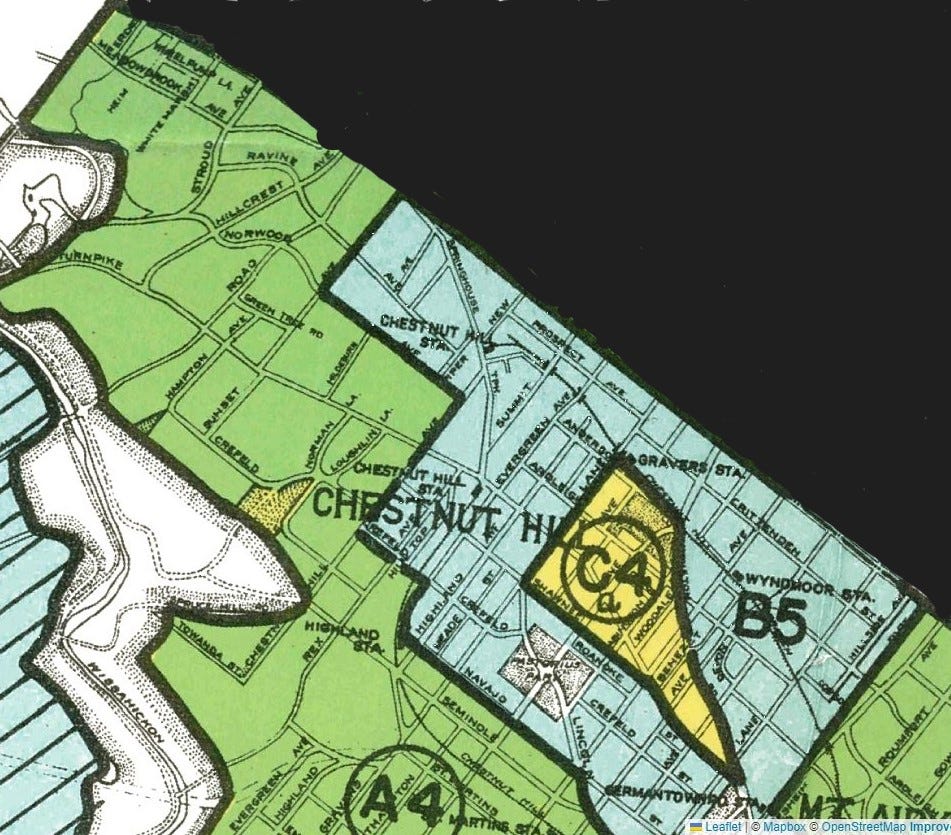
HLOC classified much of Chestnut Hill with either an “A” (colored in green) or “B” (colored in blue) rating, meaning that these areas were considered less “risky” and a good bet for lenders. People who lived in these areas would typically have no trouble getting mortgages and loans. Comments on the “A” section of Chestnut Hill noted “Byers still looking for bargains. Practically all available land is held at $20,0000 an acre. Direct roads to center of city. Many large estates in this section.” The report also noted that it was “the finest residential section of the city.” The “B” section was “high grade, but does not warrant a 1st grade rating.” Why? The streets in this section were described as “spotty,” but there was a more insidious reason as well. Reflecting the racism of the report writers wrote, “Grade schools in Chew Avenue section have about 15% negro children.” Chew Avenue is in the Mount Airy section of the city but apparently was close enough to Chestnut Hill for the reporters to group the entire area together.
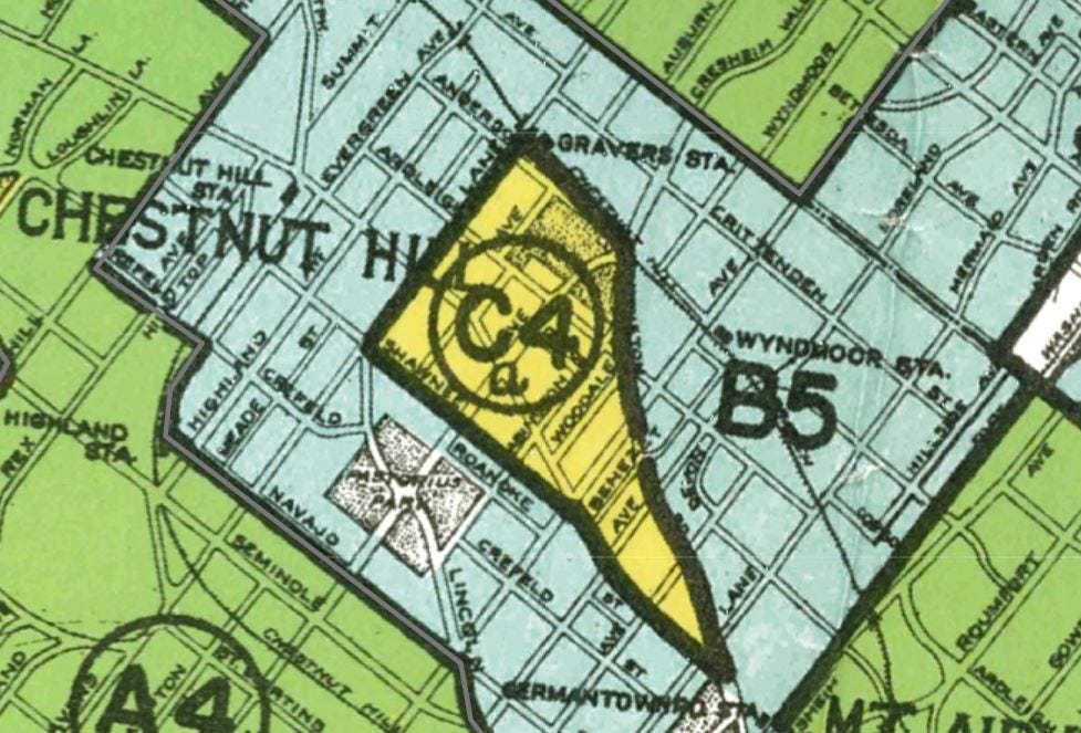
There’s also a section within the sea of blue and green that’s colored yellow, indicating a grade of “C”. This particularly caught my interest, since the rowhouse where my family resided in the 1990s is on the border of this yellow area (although we don’t think the structure was built until the 1950s). The assessors chose to group this part of Chestnut Hill with the Germantown area of Philadelphia to the southeast. The reports describe this area as “a very spotty section,” and notes “negro encroachment- some Italian on Mt. Pleasant Avenue. Influx of less desirable element.”
Today, Chestnut Hill remains one of the wealthiest sections of Philadelphia. Growing up, one of my friend’s dads was doing work at one of the large houses in that section of the city. The family who lived in the house invited me and my friend to go swimming at their pool, so I can confirm that there remain “many large estates” in that area. While it seems to be more diverse than it was when the HOLC maps were made, census data shows its income level and diversity are not representative of the city.2 I’m willing to bet that redlining in other parts of Philadelphia played a role in this, preventing some Philadelphians from getting the mortgages they needed to move to a place like Chestnut Hill.
By contrast, the neighboring community of Mount Airy is significantly more diverse.3 In the 1930s, HLOC rated the neighborhood as A, B, and C, similar to Chestnut Hill. However, in the 1960s, the area successfully integrated with residents fighting back against blockbusting and other tactics employed by real estate professionals and government officials to keep areas segregated.4 Chestnut Hill and Mount Airy provide a fascinating case study of two neighborhoods that took different paths, and I’m looking forward to exploring their stories further in the future.
Off to Oreland
That Philadelphia had redlining is no surprise. Since the city had been around since the 18th century and is a large population center, there’s little chance that it would have been spared HLOC’s markers. For Springfield Township, which includes the communities of Erdenheim, Wyndmoor, Flourtown, and Oreland, I was more uncertain about what I would find.5 Not because I didn’t think there were discriminatory housing practices there, but because I didn’t have a good sense of when the township was developed. Growing up I’d always heard that most of the area wasn’t built up until after World War II. Since some of the other maps I’d looked at left large areas unmarked due to not being developed, I wasn’t sure what the Springfield section of the map would show. Did the township have enough development to attract HLOC’s attention? Or was it still mostly farmland? Turns out the answer was both.
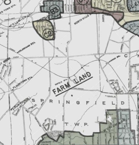
According to the map, most of Springfield was still farmland in the 1930s. Of the major sections of the township, the communities of Oreland and Wyndmoor were large enough to get HLOC ratings. The communities of North Hills and Glenside, which partially lie within the township, also received ratings. Flourtown was skipped entirely. Part of Erdenheim was included in the rating for western Wyndmoor and the other part was left blank.
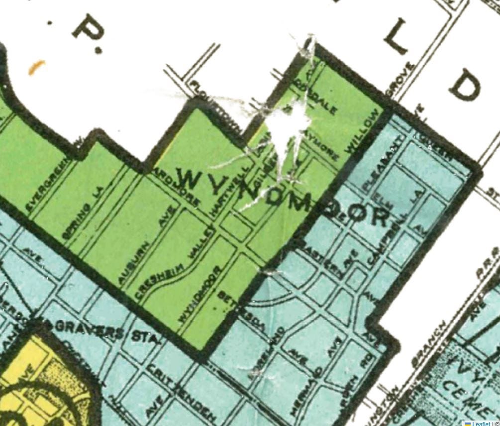
The ratings in the section of the township that did have significant development were interesting. In the southern part of the area, Wyndmoor (and part of Erdenheim) was lumped into the rating for Chestnut Hill. The sections of Wyndmoor west of Willow Grove Avenue got an “A” rating, while everything to the east got a “B” rating. Why this street was the dividing line is unclear.
Oreland is located to the north of the township. The two sections on the map, divided by the railroad line), were included in the broader assessment of the Glenside area to the East. The section below the train station was given a “C” rating for “no sewers in the section, although plans are underway to eliminate cesspools.” The raters also noted the "infiltration” of Black and Italian residents in their reasoning for the rating. The section above the railroad tracks got a “B” rating. Unlike the other section, this one had sewers. The reporters described the main detriment for this part of Oreland and Glenside as being that it was “almost solidly build- no room for expansion.”
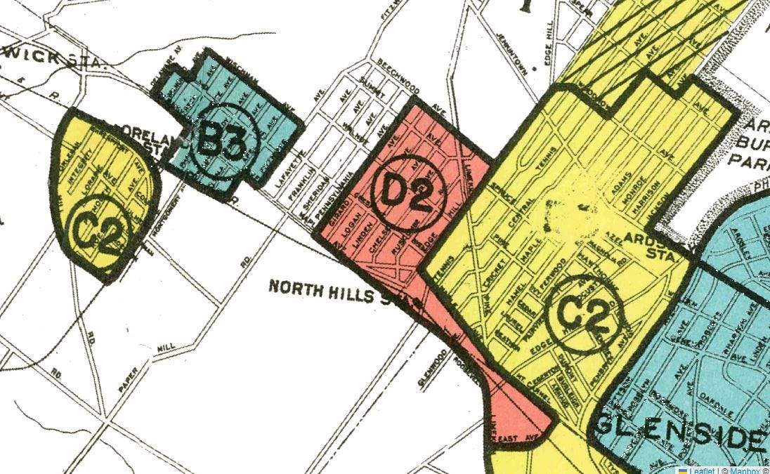
Between Oreland and Glenside was North Hills, which had the rating of “D” meaning that it was colored red on the map. The raters described the area as being a place where “Italians of foreign-born predominate. Section is very spotty with a general mixture of all types of houses,” and “mixture of population of poor class.” Today, someone would be hard-pressed to say where North Hills ends and Glenside or Oreland begins, but at the time, HLOC felt that it was different enough from these other communities and went ahead and redlined it.
By the time we moved to Springfield in the late 1990s, the farmland in Springfield was gone and development meant that the boundaries between the various communities pretty much only existed on maps. Based on recent census data, the township is noticeably less diverse than both Mount Airy and Chestnut Hill.6 A fuller investigation would need to be done to determine specific reasons for this, but I imagine that the legacy of redlining is part of the story. While only part of Springfield received HLOC ratings, redlining impacted existing and future neighborhoods by denying many people the resources to move to new places. Other discriminatory tactics might also have been deployed as well. If any of my readers are historians of this period in Springfield’s history, I’d be curious to know what your research has uncovered.
The Train That Was Never Coming Back
A source can yield multiple insights depending on who is looking at it and what they’re interested in. Stepping away from redlining for a moment, one of the biggest surprises of the map was how detailed the rail lines were. Access to trains and transit were cited as pluses in HOLC’s review, so it makes sense why they’re there, but looking at old railroad lines wasn’t top of mind when I opened the database.
For someone unfamiliar with Chestnut Hill, the fact that there were two Chestnut Hill stations only a few blocks from each other would probably stand out. Growing up in the area, however, this wasn’t surprising, I knew them as the terminus of SEPTA’s Chestnut Hill West Line and Chestnut Hill East Line. In the 1930s, there was no SEPTA (Southeastern Pennsylvania Transit Authority, which provides public transportation in the Philadelphia area). Passenger rail, in contrast to today, was primarily offered by private companies, and the two stations represented competing businesses, the Reading Railroad and the Pennsylvania Railroad. In the 1980s, SEPTA took over both lines and kept both in operation, even as it cut other regional rail routes. Aren’t two lines that terminate within walking distance redundant? Not quite. Although both lines go to Center City Philadelphia, the routes they take from Chestnut Hill are very different, which is why SEPTA keeps both lines in operation.
Springfield also has a SEPTA rail line that goes through Oreland. The Fort Washington, Oreland North Hills, and Glenside Stations are all still there, but the Fellwick station present on the map is no more. One of the other train lines that went through the township is now only used for freight, while the other lines are gone. However, the footprints of these lines are still in use. The Fort Washington Expressway, which connects to the Pennsylvania Turnpike, traces a portion of a Pennsylvania Railroad Line that passed through the township. Enfield Station on the map is right across the street from where Springfield High School is today and just north of the current location of the Springfield Library.


Another section of a former railroad, which historically went from Oreland to Conshohocken was also present on the map. Many of our long runs in high school cross country involved crossing Haws Lane and heading along a short dirt path before turning left onto another trail that took us toward Bethlehem Pike in Flourtown. After crossing that road, the trail entered a park and crossed an old railroad bridge. In high school, I’d always suspected the trail we took to get to Bethlehem Pike was an old rail line, and this map provided proof.
Versailles Down the Road
No source offers a perfect snapshot of the past, and the maps on this database are no exception. A casual viewer looking at the map might assume that between Oreland and Wyndmoor, there was nothing more in 1930s Springfield Township than roads, railroads, and farmland. In actuality, nestled between Paper Mill Road, Cheltenham Avenue, and Willow Grove Avenue was one of the most opulent estates in American history, fittingly dubbed the “Versailles of America.” 7


Edward T. Stotesbury, a Philadelphia investment banker, ordered the construction of Whitemarsh Hall as a wedding present for his second wife, and from 1921 through 1938 it played host to the Stotesburys’ lavish parties. Stotesbury was by all accounts an interesting character. His lifestyle and parties were legendary. According to one source I read, an impressed Henry Ford left one event at White Marsh Hall declaring, “It’s a great experience to see how the rich live.”8 During the 1930s as the country battled the Great Depression, Stotesbury, a strong critic of Franklin Roosevelt and the New Deal, apparently became a bit paranoid. Concerned that angry mobs, jealous of his wealth, might come after him, he purchased Thompson submachine guns to defend the estate.9
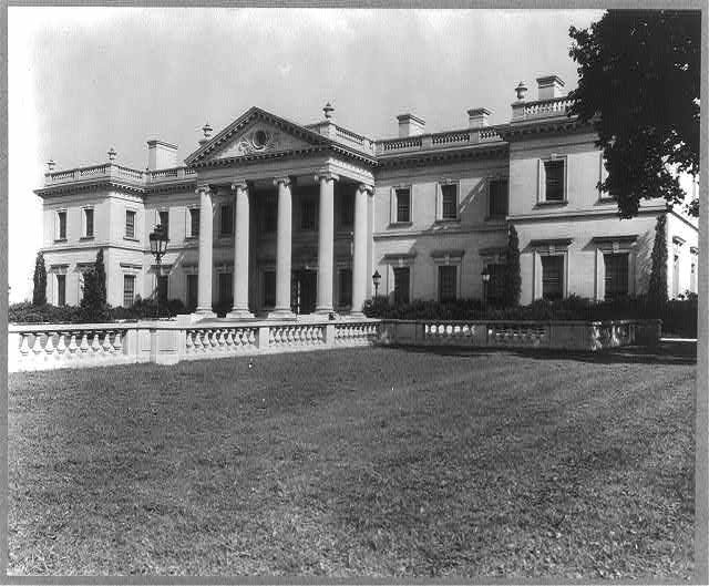
In the end, it wasn’t an angry populist mob that doomed Whitemarsh Hall, but the cold financial realities of maintaining such a palace. When Edward Stotesbury died in 1938, his widow discovered that his fortune had been shrinking significantly over the past few years (the high costs of keeping a place like Whitemarsh Hall probably didn’t help). Without the funds for upkeep, she was forced to sell the estate. Ironically, she had trouble finding a buyer. The sheer size and costs of the property meant that it was considered a risky investment. While the Penn Salt Chemical Corporation bought the property and opened a research lab at the site, after they relocated and sold the land, the buildings began to fall into disrepair. As much as people marveled at the architecture, size, and beauty of the estate, no one wanted the financial burden of maintaining it. A 1978 New York Times article noted that the property was “for sale for nothing save the cost of the land it stands on.”10 In 1980, the wrecking ball came for Whitemarsh Hall.
By the time my family and I moved to Springfield, the estate and gardens of Whitemarsh Hall were long gone. Still, some traces remained. An old gatehouse on Paper Mill Road, now converted to a private home, still stands as do several statues dotted around Wyndmoor. It was always a pleasant surprise to come across one of the sculptures when I was out running. The portico of the mansion still stands, framed between two of the townhouses built on the land. A silent marker of a different era in the township’s history.
Times Not So Long Gone
In the grand scheme of time, the 1930s wasn’t that long ago. In fact, some of my readers might have been around when this map was made. Looking at it, especially the Chestnut Hill section, it struck me how many of the streets, railways, and train stations were instantly recognizable. In Springfield, the “farmland” that took up most of the township is no more, but the streets that were on the map, by and large, are still there today.
The legacy of redlining is also still around today. The maps are a helpful tool, but they don’t capture the individual human stories of those affected by this discriminatory practice. Oral histories and written accounts from the people impacted are needed to tell that part of the story. In Alexandria, Virginia, where I currently live, the city’s oral history program has helped document some of the discriminatory housing practices, and I imagine similar efforts exist in Philly. These maps also don’t capture what happened in the years after their creation. Other policies and political events have also impacted the housing landscape since the 1930s, but someone who only looks at these maps wouldn’t have that information.
People smarter than me have written about redlining’s insidious legacies better than I ever could, and I’d recommend checking out some of the academic work on the subject. The Mapping Inequality Project has a “Further Reading,” section on the topic, which is a good place to start if any reader is interested in learning more.
I would like to briefly highlight one person I know for sure who was alive in Philadelphia during the creation of these maps. Growing up in Chestnut Hill, one of my neighbors two doors down was a woman named Louise (I’m withholding her last name for privacy reasons). Louise was Italian-American, and her parents were immigrants.11 Did she ever experience discrimination because of her ethnicity? Given what the HOLC folks wrote about the supposed “dangers” of “infiltration” by Italian immigrants in Northwest Philadelphia, it’s not outside the realm of possibility, although she never mentioned it to me.
Regardless of what might have happened in her childhood, Louise had a rich and full life. She had a strong community of friends and family. An animal lover, she also had many beloved pets over the years. She married the love of her life and, she even became a great-grandmother before she died. If anyone ever told her she was unwelcome, she didn’t let that stop her from being welcoming and kind to those she met.
Too often, we give people labels, we draw arbitrary lines on maps, and we forget the common humanity of those around us. These maps are a reminder of the pain that comes from when we give in to prejudice. However, they also provide a chance to remember people like Louise, community members, who, despite the cruelty that the world threw at them, never stopped trying to make the world a better place, in ways big and small. Growing up on a street without a lot of other kids my age, Louise was a friendly face who was always excited to see me and normally had a snack ready. While the folks at HOLC might have had a problem with her moving into a neighborhood, I would rather live next to her than Edward Stotesbury any day. I was lucky that she was my neighbor.
I was even luckier that she was my friend.
“About,” Mapping Inequality: Redlining in New Deal America,” https://dsl.richmond.edu/panorama/redlining/about
U.S. Census Bureau (2022). American Community Survey 5-year estimates. Retrieved from Census Reporter Profile page for 19118 <http://censusreporter.org/profiles/86000US19118-19118/>
U.S. Census Bureau (2022). American Community Survey 5-year estimates. Retrieved from Census Reporter Profile page for 19119 <http://censusreporter.org/profiles/86000US19119-19119/>
Kyle DeMaria, “Mapping Our Community: Residential Segregation in Mt. Airy and in Philadelphia,” Federal Reserve Bank of Philadelphia, Winter 2016, https://www.philadelphiafed.org/community-development/housing-and-neighborhoods/mapping-our-community-residential-segregation-in-mt-airy-and-in-philadelphia Keith Rolland and Kyle DeMaria, “Mt. Airy: A Legacy of Intentional Integration,” Federal Reserve Bank of Philadelphia, Winter 2016, https://www.philadelphiafed.org/community-development/inclusive-growth/mt-airy-a-legacy-of-intentional-integration Abigail Perkiss “Mount Airy (West)” The Encyclopedia of Greater Philadelphia, accessed on December 19, 2023, https://philadelphiaencyclopedia.org/essays/mount-airy-west/
Springfield also includes parts of the communities of Lafayette Hill, Glenside, Fort Washington, and North Hills.
U.S. Census Bureau (2022). American Community Survey 5-year estimates. Retrieved from Census Reporter Profile page for Springfield Township, Montgomery County, PA <http://censusreporter.org/profiles/06000US4209173088-springfield-township-montgomery-county-pa/
Barbara Marhoefer, “Whitemarsh Hall: A Palace in Ruin,” The New York Times, January 29, 1978, https://www.nytimes.com/1978/01/29/archives/whitemarsh-hall-a-palace-in-ruin-palace-of-the-twenties-in-ruin.html
David Patrick Columbia “The Rise and Fall of the Stotesburys,” New York Social Diary, March 6, 2023, https://www.newyorksocialdiary.com/the-rise-and-fall-of-the-stotesburys/
Confirmed via a conversation with the archivist at the Springfield Historical Society
Barbara Marhoefer, “Whitemarsh Hall: A Palace in Ruin,” The New York Times, January 29, 1978, https://www.nytimes.com/1978/01/29/archives/whitemarsh-hall-a-palace-in-ruin-palace-of-the-twenties-in-ruin.html
Much of what I know about Louise’s early life I heard many, many years ago, so it is possible that I might not have the details of her life 100% correct. I’m confident in my recollections, but wanted to state this in the interest of transparency.